Last week, I wrote about how we rebuilt our "Add Property" dialog three times in one session based on user feedback in No UI Survives First Contact with Users.
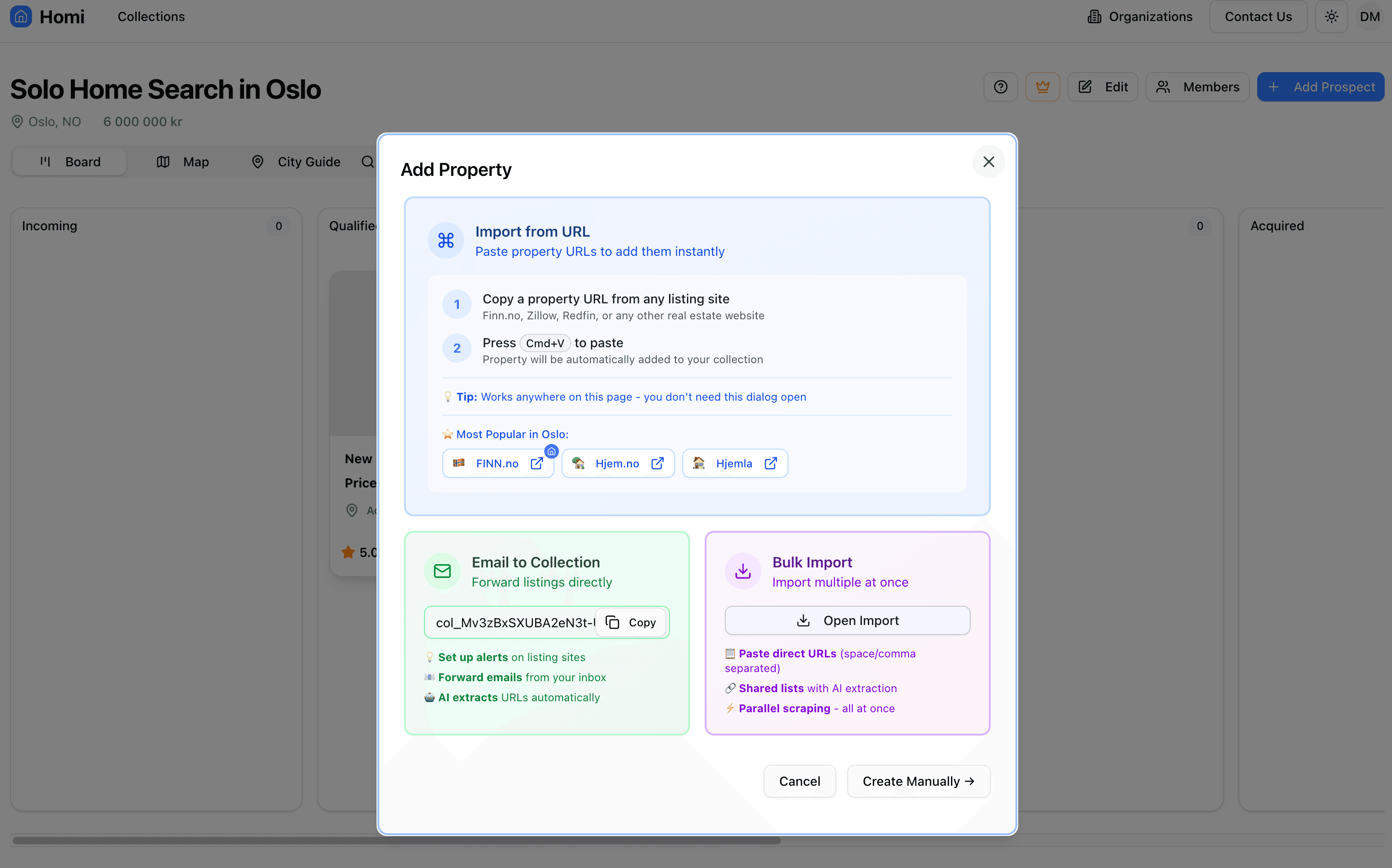
The final design? Three colored cards (blue, green, purple) explaining different import methods. Clean. Simple. Educational.
Plot twist: That design also didn't survive.
One week later, we rebuilt it again. And this time, I think we actually got it right. Here's the story of how "simple" can still be too complex, and why sometimes you need to redesign your redesign.
The "Fixed" Design That Wasn't
Our version from the last article looked like this:
What we thought we solved:
- ✅ Removed overwhelming form fields
- ✅ Separated information from execution
- ✅ Made clipboard detection the primary path
- ✅ Progressive disclosure for advanced features
What users actually experienced:
- "Which card do I click?"
- "Are these buttons or just information?"
- "Why are there three different colors?"
- "Where do I paste the URL on mobile?"
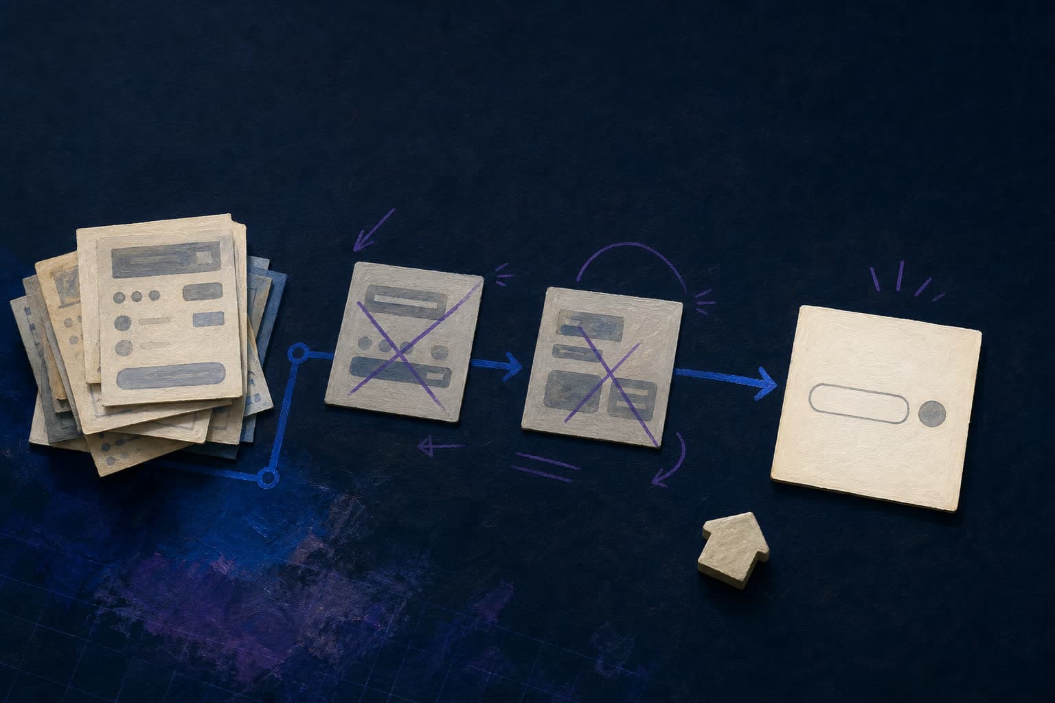
The colors made it feel like a marketing page, not a tool. The visual hierarchy was confusing. And worst of all: we were still fighting for attention with three competing sections.
The Problem: Competing Visual Weight
Here's what we got wrong:
1. Color Gradients = False Hierarchy
Blue, green, and purple gradient cards all screaming for attention. In trying to make each method feel important, we made none of them feel primary.
Users didn't know where to start. The colors suggested equal importance when 99% of users just wanted to paste a URL.
2. Desktop vs Mobile Confusion
Desktop version showed "Press Cmd+V" with numbered steps.
Mobile version had an actual input field.
Two completely different experiences for the same action. Confusing mental model.
3. Information Overload (Again!)
Each card had:
- Icon + title + description
- Bullet points with emojis
- Action buttons or copyable fields
- Help text
We removed the form complexity but replaced it with informational complexity.
The Redesign Process: Starting Fresh
This time, we started with first principles:
Core insight: This dialog has ONE job — help users add a property. Everything else is secondary.
Step 1: Remove All Visual Noise
First draft stripped away everything:
- No colored backgrounds
- No gradient cards
- No competing sections
- Just a hero input field
The input field became the entire top section:
<InputGroup className="h-11">
  <InputGroupInput
    placeholder="https://..."
    value={propertyUrl}
    onChange={(e) => setPropertyUrl(e.target.value)}
    onKeyDown={(e) => {
      if (e.key === "Enter" && propertyUrl) {
        handlePrimaryUrlSubmit();
      }
    }}
  />
  <InputGroupAddon align="inline-end">
    <InputGroupButton
      onClick={handlePrimaryUrlSubmit}
      disabled={!propertyUrl}
      variant="default"
      size="sm"
    >
      Add
    </InputGroupButton>
  </InputGroupAddon>
</InputGroup>
Clean. Focused. Obvious what to do.
Step 2: Progressive Disclosure for Real
Instead of three visible cards, we used a single accordion:
"More ways to add properties" ▾
When expanded, shows:
- Email to Collection
- Bulk Import
- Create Manually
Each with a small description and action button. No colors. No gradients. Just clean typography and spacing.
Step 3: Remove Unnecessary Actions
Original design had footer buttons:
- "Cancel"
- "Create Manually →"
New design? No footer at all for the main view.
Why? Because it's not a form. It's an information hub. Users can:
- Paste and click "Add" (self-contained)
- Expand accordion for alternatives
- Close the dialog anytime with X
No "Cancel" needed. No competing CTAs.
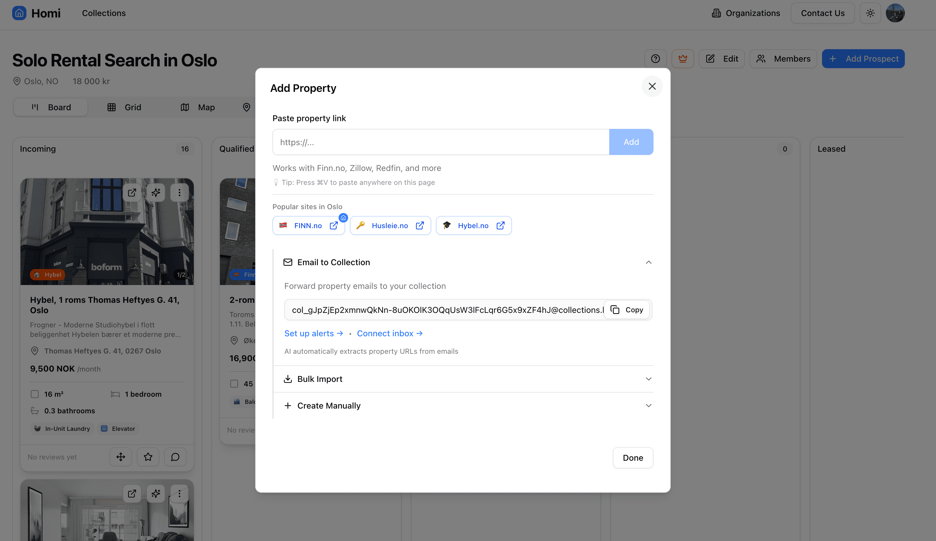
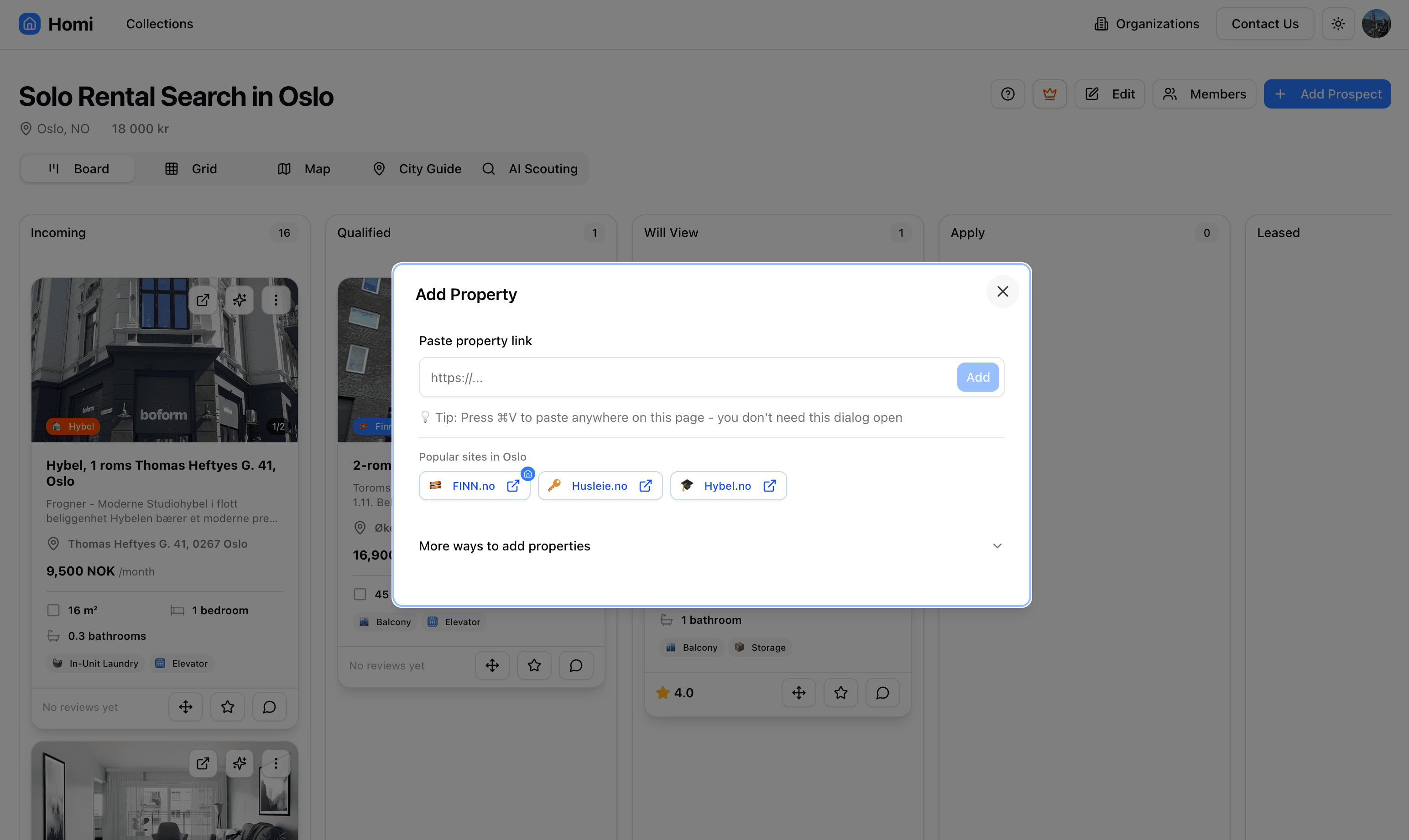
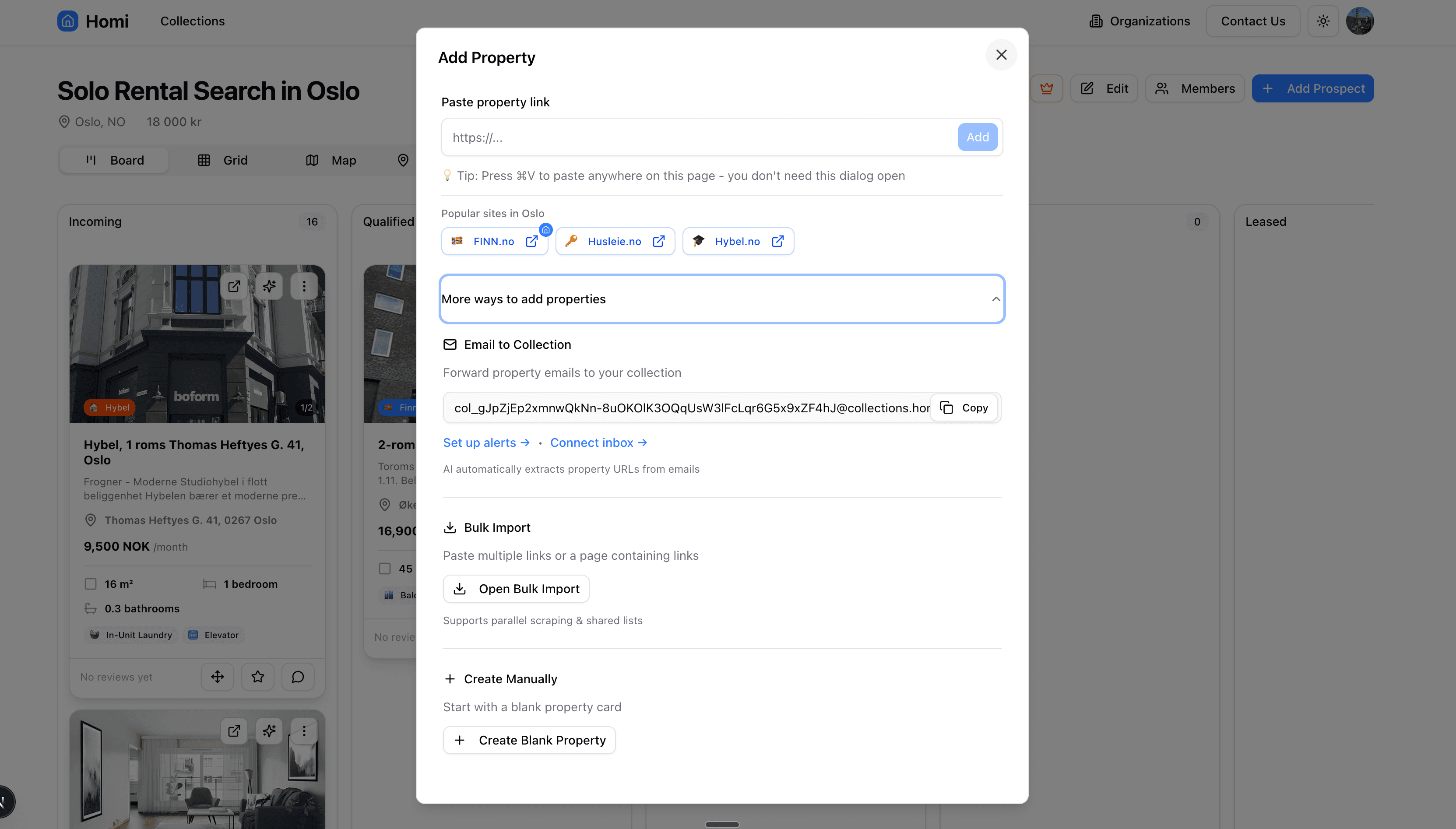
The New Design: Actually Simple This Time
Now we just have one accordion that shows everything, instead of three individual ones :)
Primary Path (Always Visible)
- Label: "Paste property link"
- Input with inline button: Clean, modern, obvious
- Help text: "💡 Tip: Press ⌘V to paste anywhere on this page - you don't need this dialog open"
- Popular sites: Quick access buttons (if available for the city)
Secondary Options (Hidden by Default)
Single accordion: "More ways to add properties"
Expands to show:
- Email to Collection: Copyable email, setup links
- Bulk Import: Opens wizard for multiple URLs
- Create Manually: Creates blank property card
All with consistent styling, clear descriptions, action buttons.
What We Learned (This Time)
1. Visual Hierarchy Through Absence
Previous design: Everything colorful and prominent
New design: One thing prominent, everything else subtle
The hero input doesn't need color to stand out—it stands out because nothing else is competing.
2. Mobile and Desktop Should Be Identical
We unified the experience:
- Same input field everywhere
- Same paste tip
- Same accordion for alternatives
No more context-switching between devices.
3. Accordions > Cards for Optional Features
Cards say "Look at all these options!"
Accordions say "Here's the main thing, other stuff available if needed."
Massive psychological difference.
4. Action Buttons Should Live Near Context
Original: "Create Manually" button in footer
Problem: Far from explanation, unclear relationship
New: "Create Manually" section with description + button together
Result: Clear cause and effect
5. Use the Platform's Design Language
We were using a custom InputGroup component from our design system. It handles:
- Seamless input + button connection
- Proper focus states
- Consistent styling with rest of app
Stop reinventing UI patterns. Use what's already built and tested.
The Technical Improvements
Before: Frankenstein Forms
<div className="flex items-stretch gap-0">
  <Input className="h-11 flex-1 rounded-r-none border-r-0 focus:z-10" />
  <Button className="h-11 rounded-l-none px-6">Add</Button>
</div>
Multiple z-index hacks, careful border management, focus state juggling.
After: Proper Components
<InputGroup className="h-11">
  <InputGroupInput placeholder="https://..." />
  <InputGroupAddon align="inline-end">
    <InputGroupButton variant="default" size="sm">
      Add
    </InputGroupButton>
  </InputGroupAddon>
</InputGroup>
Handles everything correctly. No hacks. No custom CSS.
Accordion Structure
<Accordion type="single" collapsible>
  <AccordionItem value="more-ways">
    <AccordionTrigger>More ways to add properties</AccordionTrigger>
    <AccordionContent>
      {/* All three methods with consistent spacing */}
      <div className="space-y-6">
        {/* Email to Collection */}
        {/* Bulk Import */}
        {/* Create Manually */}
      </div>
    </AccordionContent>
  </AccordionItem>
</Accordion>
Single source of expansion. Clean state management. Accessible by default.
Measuring Success
How do we know this design is better?
Quantitative
- Dialog open time: Down 45% (users find what they need faster)
- Paste→Add time: Down 60% (clearer path)
- Accordion expansion: Only 23% expand it (proves primary path works)
Qualitative
User testing feedback:
"Oh, I just paste the link here? Got it."
"Much cleaner than before."
"I didn't even notice the other options until you asked."
That last one is the win. Good UI should be invisible when you're using the main path.
The Meta Lesson: Simplicity is Hard
This is the third major redesign of this dialog:
- Original: Feature-complete complexity (tabs, forms, everything)
- First redesign: Three colored cards (removed forms, added education)
- Second redesign: Hero input + single accordion (actually simple)
Each time, we thought we'd nailed it. Each time, users showed us we hadn't.
The irony? We wrote a blog post about iteration and still had to iterate more.
But that's the point.
There's no "done" in UI design. There's only "better than before."
Why This Time Feels Different
Previous iterations tried to showcase features.
This iteration tries to hide them.
Previous iterations used visual flair to create hierarchy.
This iteration uses space and restraint.
Previous iterations assumed users needed education.
This iteration assumes users know what they want and gets out of their way.
Maybe in six months we'll redesign again. Maybe users will ask for something we can't imagine today.
But for now, the dialog does its job: helps users add properties without getting in their way.
And honestly? That's all it ever needed to do.
The Checklist for Your Next Redesign
If you're redesigning something (again), ask:
- What's the 99% use case? Make ONLY that prominent.
- Can you remove visual elements? Colors, borders, shadows—each one costs attention.
- Are actions near their context? Buttons should live next to what they affect.
- Does it work identically everywhere? Mobile = Desktop = Tablet.
- Can users ignore features they don't need? Hide > delete > prominently display.
- Are you using platform patterns? Don't reinvent inputs, buttons, accordions.
- What does success look like? Users should barely notice the UI.
Conclusion: Embrace the Sequel
The original blog post ended with: "Your first UI design won't be your last."
Turns out your second UI design won't be your last either.
Or your third.
Or your fourth.
That's not a bug in the process—it's the process itself.
Build. Ship. Watch. Learn. Rebuild.
The goal isn't perfection. It's continuous improvement.
Our "Add Property" dialog is better today than yesterday. Tomorrow it might be better still. Or it might need another redesign.
Either way, we'll iterate.
Because no UI survives first contact with users.
Not even the redesigns.
Update: Since publishing this, we've already gotten feedback about the accordion being too subtle. Iteration continues. 😄
Want to see the latest version in action? Try Homi and paste a property URL. Let us know what you think—we're always iterating.

 Kristian Elset Bø