Every developer knows the adage: "No plan survives contact with the enemy." In software design, we have our own version: No UI survives first contact with users.
Earlier this week, we rebuilt our core "Add Property" dialog three times in a single session. Not because the original design was bad—it was thoughtful, feature-complete, and followed best practices. But it didn't match how users actually wanted to work.
This is the story of how user feedback transformed a complex multi-tab form into a simple three-card information hub, and what we learned along the way.
The Original Design: Feature-Complete Complexity
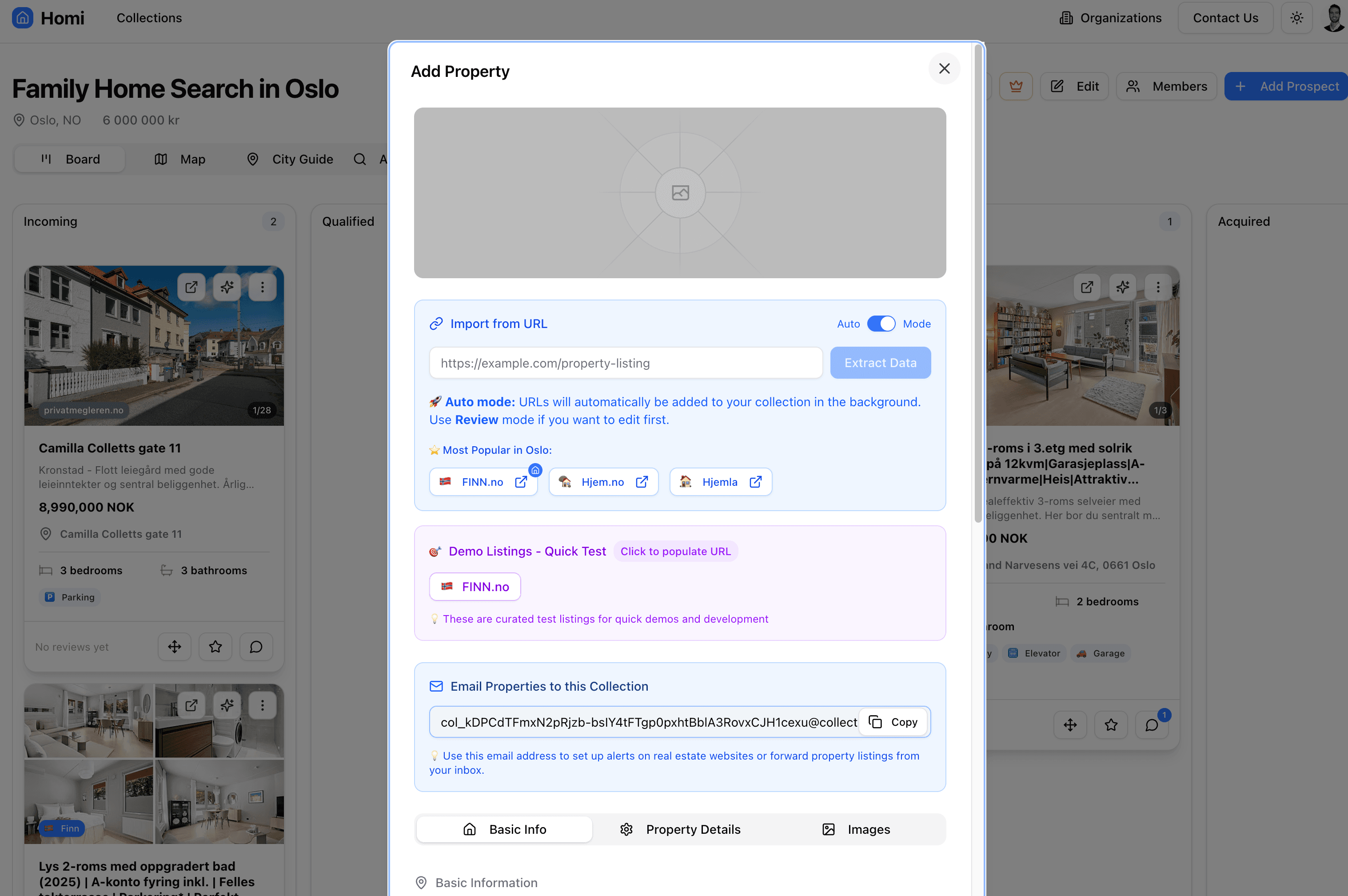
Our first iteration looked like this:
The thinking:
- Beautiful banner image at the top
- Full scraping section with URL input
- Auto/Review mode toggle
- Demo listings for testing
- Email forwarding info
- Complete manual entry form with three tabs
- Every feature accessible from one place
The problem: 99% of users just wanted to paste a URL and move on. The complexity was overwhelming.
First Contact: "It's Too Much"
When we showed it to our first Oslo user testing batch imports from Finn.no, the feedback was immediate:
"Wait, where do I paste the URL?"
"Do I need to fill out all this?"
"What's the difference between Auto and Review mode?"
The dialog optimized for comprehensiveness when users needed speed. Classic designer's trap.
Iteration 1: Simplify the Layout
We restructured around usage patterns:
Row 1: Import from URL (full width, prominent)
Row 2: Email to Collection (compact sidebar)
Row 3: Bulk Import button
Row 4: Manual creation (collapsed by default)
Better! But still issues:
- Manual form still cluttered the interface
- Email section felt cramped
- Competing calls-to-action
Iteration 2: Rethinking the Mental Model
Then came the insight: This dialog isn't for creating properties—it's for explaining import methods.
The actual property creation happens via Cmd+V clipboard detection (already built into our CollectionProvider). The dialog should educate, not execute.
We split responsibilities:
- Create Dialog: Information hub about import methods
- Edit Dialog: Actual data entry for manual creation
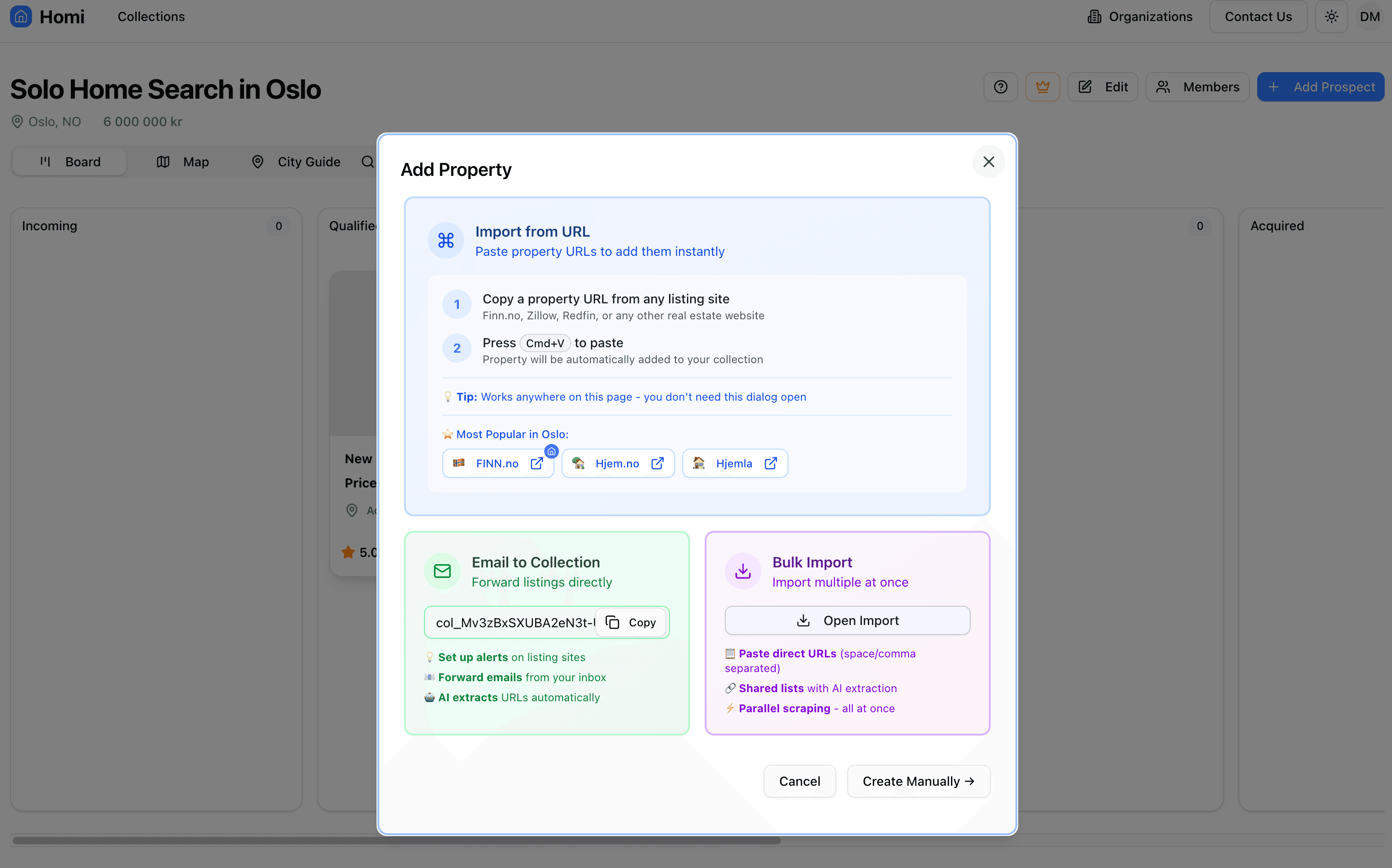
Final Form: Three Cards, Zero Forms
The breakthrough: Remove all forms from the create dialog.
Card 1 (Blue): Import from URL
- "Copy URL → Press Cmd+V"
- Clear instruction: "Works anywhere on this page"
- Popular sites for quick access
- No input field needed!
Card 2 (Green): Email to Collection
- Copyable email address
- Three use cases explained
- AI-powered extraction
Card 3 (Purple): Bulk Import
- Opens a wizard with tabs
- Direct URLs or shared favorites lists
- Parallel processing with real-time updates
Footer: Just two buttons
- "Cancel" (outline)
- "Create Manually →" (secondary) - creates minimal listing, opens edit dialog
The Technical Breakthrough: Minimal + Edit
Instead of maintaining two complete forms (create vs edit), we use this pattern:
const handleManualCreation = () => {
  // Create minimal property with smart defaults
  createMutation.mutate(
    {
      propertyListing: {
        title: "New Property",
        listingType: collection.intention,
        unitSystem: collection.unitSystem,
        currency: collection.currency,
        images: [],
      },
    },
    {
      onSuccess: (newListing) => {
        closeCreateDialog();
        openEditDialog(newListing.id); // Immediately open edit
      },
    },
  );
};
Benefits:
- Single source of truth (edit dialog = full form)
- Zero duplication
- Instant manual creation → user lands in familiar editing experience
- Newly created listings use existing edit dialog (same UX as editing imported ones)
Lessons Learned
1. Watch Real Users (Not Just Listen)
The first user didn't say "this is too complex." They showed confusion through questions and hesitation. Body language and behavior reveal more than words.
2. Separate Information from Execution
Users needed to understand their options before choosing one. Combining education + execution in one dialog created cognitive overload.
3. Respect the 99% Use Case
We had three import methods:
- URL paste: 99% of usage
- Email forwarding: Less than 1%
- Bulk import: Power users with large lists
The dialog should optimize for the 99%, not showcase every feature equally.
4. Progressive Disclosure is Your Friend
Manual creation became:
- Simple button → 2. Minimal creation → 3. Full edit dialog
Each step reveals only what's needed, when it's needed.
5. Code Simplicity Follows UX Simplicity
Removing forms from the create dialog:
- Eliminated ~2,200 lines of code
- Merged separate import dialog into wizard flow
- Removed ScrapingSection component entirely
- Made testing easier
- Significantly reduced bundle size
Clean UI = clean code.
The Real Kicker: Centralized Edit Dialog
We also moved the edit dialog from individual property cards to the CollectionProvider:
// Before: Each card had its own edit dialog state
const [editDialogOpen, setEditDialogOpen] = useState(false);
const [shouldRenderEditDialog, setShouldRenderEditDialog] = useState(false);

// After: One edit dialog for entire collection
const [editingListingId, setEditingListingId] = useState<string | null>(null);
const editingListing = collection.propertyListings.find(
  (l) => l.id === editingListingId,
);
Result:
- Single dialog instance (not N duplicates)
- Consistent behavior everywhere
- Easy to trigger from any context
- Fresh data on every open (no stale state issues)
Iteration Speed Matters
All three iterations happened in one afternoon. Why could we move so fast?
- Good architecture - CollectionProvider already handled Cmd+V detection
- Type safety - TypeScript caught issues immediately
- Component reuse - PopularRealEstateSites, CopyableField, etc.
- No meetings - Direct user feedback → immediate iteration
This is only possible with:
- Strong typing throughout the stack
- Well-tested core functionality
- Willingness to throw away code
The Paradox of Feature-Rich Design
We started with more features visible:
- URL import
- Screenshot import
- Manual creation (full form)
- Email forwarding
- Demo listings
- Bulk import
- Auto/Review toggle
We ended with the same features, but only three visible at once. Everything else lives one click away.
Counterintuitive truth: Hiding features can make them more discoverable. A focused interface with clear paths beats a comprehensive one with analysis paralysis.
Conclusion: Embrace the Iteration
Your first UI design won't be your last. That's not failure—it's the process.
The faster you can:
- Ship to real users
- Watch them struggle (or succeed)
- Rebuild based on learnings
- Repeat
...the better your product becomes.
Our "Add Property" dialog will probably change again. Maybe we'll add visual drop zones. Maybe we'll integrate more AI. Maybe users will ask for something we never imagined.
And that's okay. Because we built it to iterate, not to last forever.
The moral: Design for the 99% use case. Make it delightfully simple. Then hide the power features one click away. Your users (and your codebase) will thank you.
Want to see the import feature in action? Try Homi and experience how fast property research can be.